Fast, Efficient, Hassle-Free
Fast, Efficient, Hassle-Free
Formant in a nutshell
Formant is a front-end Javascript framework built for speed and simplicity.
There is no compilation, no transpilation — what you write is what runs. Even CSS is handled directly in JS.
Formant’s philosophy : *absolute control*. DOM rendering is ultra-fast, and you decide how to handle heavy workloads. No hidden runtime, no magic layer.
Unlike React or Vue, Formant doesn’t implement SSR. Modern search engines already execute Javascript before indexing, so SEO is not a concern (even if that used to be true a decade ago). We prefer to keep the rendering pipeline lean, without the overhead of clientside hydration.
Back when JS had no static type checker, factories were the go-to solution. This is the pattern used in Formant (and they are still equivalent to the mechanisms used internally by Typescript). If you know React or Vue, think of Formant as the “low-level, no-hidden-cost” alternative.
In short : predictable Javascript, strong typing mindset.
With Formant you get raw predictability and performance — closer to the metal, minimal abstractions, nothing between you and the browser.
Installation
These steps assume you have NodeJS v20 or higher, git and curl installed on your OS, and additionnaly the unzip utility.
(curl is installed by default, if you have version 1803 or later of Windows 10)
If you’re under Powershell, you need to disable the execution policy in order to run *.ps1 scripts. So first run
Set-ExecutionPolicy -ExecutionPolicy Bypass -Scope process
or just execute everything from the Windows command line, or from your favorite terminal.
All commands should work as well under Linux and MacOS.
Preferably from an empty folder, run the following commands :
npm install formantjs"./node_modules/formantjs/install"
Then :
cd projects

npx grunt --appName=<choose a name for your first app> createApp

npx grunt --appName=<your first app> build
(If you see the message Done without error, you can securely ignore the error >> Local Npm module "grunt-load-gruntfile" not found, as it’s a false positive from grunt, and the module has actually been found)
And test everything worked well (TCP port 3000 must be available, or change it in server.js) :
cd <your first app>/dist

node server.js
You should now see the "Hello" message in your browser.
(This server is only thought to ensure the build process went well, you may use it for developpement or use your prefered http server)
Finally, start creating something.
In another terminal, run the following commands :
cd projects

npx grunt --appName=<your first app> watch:build
Make a visible change in the file located at
projects/<your first app>/src/App/launcher/app.js
and save.
Refresh the page in the browser manually one time, and after that, it will reload your app each time you change something.
Contributing to the framework
Building from the sources is quite similar to a standard build, apart from the fact you’ll download the sources... They’ll be located in the "codebase" folder.
The CSS style of the components from the integrated library must reside in a mongo database running locally on the standard 27017 port (you’ll need the collection from this repo, and you could use the mongoDB Compass application to insert it).
The bundler will access the following db socket (name your db accordingly) :
mongodb://localhost:27017/themed_components
From the folder where you installed formantJS, run the following command :
"node_modules/formantJS/installDevBundler"
Then, create an app like you did in the "Installation" chapter, and run "buildFromSources" instead of "build", as follows :
cd projects

grunt --appName=<choose an name for a new app> createApp

grunt --appName=<your app> buildFromSources
And you may test everything worked well the same way we did in the previous chapter :
cd <your app>/dist

node server.js
You should now be able to see the "Hello" message in your browser.
Finally, the livereload command becomes (run it from the "projects" folder) :
grunt --appName=<your app> watch:buildFromSources
Minimal "Hello world !"
The "Hello world !" example might look verbose at first, but remember : there’s no hidden transpilation step or external magic. Everything’s right there — transparent, loggable, and ready for you to dig into. If you’re the tinkering type, you’ll love the freedom to tweak and extend it however you want. ;)
[Source:minimalHelloWorld]
You may want to alias the names of the constructors, as you become familiar with them, but for now, we’ve focused on the legibility, understandability and extensibility of the code.
Explicit initialization ( via App.renderDOM() ) isn’t always needed, there are cases where the framework handles it implicitely. For the examples of that documentation, we’ll stick with calling it explicitely.
Reactive "Hello world !"
This is just to give you a "taste of it".
The reactivity principles are exposed progressively in the documentation, until you master them, through further chapters.
[Source:reactiveHelloWorld]
Styling
In Formant, styles are a home-cooked flavor of CSS-in-JS.
The "styleWrapper" property of a template holds the full implementation of the Stylesheet DOM object.
When you put a hyphen ("-") in the "nodeName" property, the rendered DOM object automatically becomes a DOM custom-element.
Plus, it’s set up with a shadow-DOM — meaning it’s isolated from the rest of the page’s styles through its "shadowRoot" property.
That way, the stylesheet linked to the component is scoped to itself.
You don’t have to stress about CSS name clashes or complicated debates over the “right” way to name selectors.
As your codebase grows, you’ll create your own component types, separating styling, templates, and constructors into different files.
We’ll cover how to do that easily in upcoming chapters.
React vs Formant : Tracing Side Effects and Rendering Philosophy
We often describe Formant as a React-like, but one subtle point when comparing React and Formant is why React enforces patterns like useEffect and useMemo.
React and Full Tree Re-Renders
React’s rendering model is tree-based : whenever a component’s state changes, React conceptually re-walks the entire subtree. To avoid recalculating everything, React introduces useEffect, useMemo, and useCallback to control what persists and what recomputes.
This isn’t solving an “application design” problem, but a rendering model problem : once you decide that the view is a pure function of state, you must rebuild it on every change. Hooks exist to make that process efficient and predictable.
Hooks : Separating State, Callbacks, and JSX
For example, consider a Pan & Zoom tool component :
let componentProps: zoomToolProps,

    initialZoomLevel: number,

    buttonTopCoordState: number = 0,

    middleClickOffset: number,

    tempButtonHeight: number,

    lastClickMoveOffset: number,

    currentScrollingAvailableSize: number,

    buttonTopCoord: number,

    setButtonTopCoord: Function,

    zoomLevel: number,

    setZoomLevel: Function;
In React, each of these must be wrapped in a hook :
useState for persistent values
useMemo for derived values
useEffect for DOM updates
With dozens of variables, the code telescopes into a web of hooks. Even simple math—like computing a height or offset—ends up split across multiple hook calls and dependency arrays.
Summary Diagram
Both approaches isolate scope. Formant just doesn’t add an extra layer of indirection.
React : Full tree re-render model
ComponentA render

 ├─ ComponentB render

 │   ├─ ComponentC render

 │   │   └─ useEffect / useMemo triggered

 │   └─ ComponentD render

 └─ ComponentE render
Every render walks the whole subtree
Hooks are needed to control persistence and side effects
Side effects can be scattered and harder to trace
Formant : Reactive property tree
ReactiveProperty1 changes

 ├─ triggers DOM property update1

 └─ triggers ReactiveProperty2 change

       ├─ triggers DOM property update2

       └─ triggers ReactiveProperty3 change

             └─ triggers DOM property update3


ReactiveProperty3 changes

             └─ triggers DOM property update3
Only affected reactive properties propagate updates
DOM updates are explicit and scoped to each property
No need for full tree traversal or hidden re-renders
Side effects are predictable and visible
The result is a more direct and predictable mapping from state changes to UI updates.
And don’t misunderstand us, defining your own reactivity tree implies a bit of imperative coding, but declarative is great. We just think that "sticking to the web platform" is always a sound idea. That’s why, as you’ll read in further chapters, we built the most declarative templating system we could, while keeping user interactions and reactive updates imperative in some places.
Templating Principle
A component has two parts :
a top-level view, called the "host"
and, optionally, an array of child views, called "members".
The structure looks like this :
// pseudo-code

// nota: the type is named here {ComponentTemplate} for clarity.

// Its actual name is {HierachicalTemplate}, read further.


type ComponentTemplate {

    host: ViewTemplate,

    members: Array<ViewTemplate>

}
A ViewTemplate defines a single DOM node. That node gets appended to the DOM :
if it’s in a "member" view, it’s appended to the "host" node
if it’s a "host" view, it’s appended to the parent component’s top-level node
If the component is at the root of your app, the "host" node is appended to your app’s root node via "App.renderDOM()".
You’d pass a template like this to the ComponentWithView constructor — the most basic component type in the Formant framework.
In "TemplateFactory", this kind of component template is called a HierarchicalTemplate. You’ll see why in a moment.
— -
At this point, you know how to define a row in a form :
// pseudo-code

componentTemplate = {

    host: '<div>',

    members: [

        '<label>',

        '<input>'

    ]

}
— -
Now, let’s talk about nested components.
You create them with the CompoundComponent constructor. A CompoundComponent isn’t a component type by itself — it’s a factory that creates a ComponentWithView that hosts other components.
Its structure is doubly hierarchical :
// pseudo-code

type CompoundComponentTemplate {

    host: ComponentTemplate,

    members: Array<ComponentTemplate>

}
To sum up :
a component template = "host" view + optional "member" views
the type name for such a template is HierarchicalTemplate
you nest components by putting HierarchicalTemplates as both the "host" and "members" of another HierarchicalTemplate
— -
Let’s look at some real code.
Formant was designed before TypeScript existed, so it uses factories for type safety — basically giving you the same guarantees as if it were written in TypeScript (in fact, the framework’s code resembles transpiled TS code).
You define a template with "TemplateFactory.createDef()" :
const componentTemplate = TemplateFactory.createDef({

    host: TemplateFactory.createDef({

        nodeName: 'div'

    }),

    members: [

        TemplateFactory.createDef({

            nodeName: 'label'

        }),

        TemplateFactory.createDef({

            nodeName: 'input'

        })

    ]

});

new App.componentTypes.ComponentWithView(componentTemplate);
As you can see, "createDef()" infers the template type you’re building. Passing it an object with a "host" property produces a HierarchicalTemplate, otherwise it’s a "ViewTemplate".
If you don’t need member views, there’s a shortcut : "TemplateFactory.createHostDef()" lets you create a HierarchicalTemplate without explicitly passing a "host" property.
const componentTemplate = TemplateFactory.createHostDef({

    nodeName: 'p'

});
That’s it for the basics.
You can stop here, or keep reading for more hands-on examples.
Complete Nesting Example
As we saw in the previous section of this chapter, you create a hierarchy of components by nesting HierarchicalTemplates. So an example in real code for the above would be :
const nestedComponentTemplate = TemplateFactory.createDef({

    host : TemplateFactory.createHostDef({

        nodeName : 'fieldset'

    }),

    members : [

        TemplateFactory.createDef({

            host : TemplateFactory.createDef({

                type : 'ComponentWithView',

                nodeName : 'div'

            }),

            members : [

                TemplateFactory.createDef({

                     nodename : 'label'

                }),

                TemplateFactory.createDef({

                     nodename : 'input'

                })

            ]

        })

    ]

});

new App.componentTypes.CompoundComponent(nestedComponentTemplate);
Notice the "type" property : by design, the CompoundComponent constructor instantiates fhe "fieldset" as a ComponentWithView, and you only specify the "type" property for child components.
You may also pick a type in the framework’s core or in the component library, and use it in your custom component. For example, the above snippet could be simplified to :
const nestedComponentTemplate = TemplateFactory.createDef({

    host : TemplateFactory.createHostDef({

        nodeName : 'fieldset'

    }),

    members : [

        TemplateFactory.createDef({

            host : TemplateFactory.createHostDef({

                type : 'CompoundComponent',

                nodeName : 'div'

            }),

            members : [

                TemplateFactory.createHostDef({

                     type : 'TextInput'

                }

            ]

        })

    ]

});

new App.componentTypes.CompoundComponent(nestedComponentTemplate);
As a side note :
You’ll most often start defining a custom component by creating a default template for it. This default template will typically look very much like the example above. In such cases, the "type" property can be set in the "host" to indicate that the fieldset inherits from a type in the component library.
Finally, let’s look at how you can give your components a bit more structure by adding sub-sections to hold child nodes. A HierarchicalTemplate comes with a "subSections" property — basically an array of components or views.
If a member view has a number set in its `section` property, its DOM node won’t be appended to the component’s "host" node like usual. Instead, it’ll go into the sub-section with the matching index in the `subSections` array.
Here’s what that looks like :
An example speaks louder than words :
const nestedComponentTemplate = TemplateFactory.createDef({

    host : TemplateFactory.createHostDef({

        nodeName : 'form'

    }),

    subSections: [

        TemplateFactory.createDef({

            nodeName : 'fieldset'

        }),

        TemplateFactory.createDef({

            nodeName : 'div'

        })

    ],

    members : [

        TemplateFactory.createDef({

            host : TemplateFactory.createHostDef({

                type : 'CompoundComponent',

                nodename : 'div',

                section : 0

            }),

            members : [

                TemplateFactory.createHostDef({

                     type : 'TextInput'

                }

            ]

        }),

        TemplateFactory.createHostDef({

            nodename : 'button',

            section : 1,

            attributes [

                {type : "submit}

            ]

        })

    ]

});

new App.componentTypes.CompoundComponent(nestedComponentTemplate);
Cheat-sheet
A component has two parts :
Top-level view ("host")
Optional array of child views ("members")
 // pseudo-code

type HierachicalTemplate = {

    host: ViewTemplate,

    members: Array<ViewTemplate>

}
Appending to DOM
"member" views → appended to "host" node
"host" view → appended to parent component’s top-level node
Root component → appended via App.renderDOM()
HierarchicalTemplate
A ComponentTemplate with a "host" and optional "members" is called a HierarchicalTemplate.
Nested components are just HierarchicalTemplates used as both "host" and "members".
Template Factories
TemplateFactory.createDef() → infers type, produces a HierarchicalTemplate
Shortcut : TemplateFactory.createHostDef() for host-only templates
const componentTemplate = TemplateFactory.createDef({

    host: TemplateFactory.createDef({ nodeName: 'div' }),

    members: [

        TemplateFactory.createDef({ nodeName: 'label' }),

        TemplateFactory.createDef({ nodeName: 'input' })

    ]

});

new App.componentTypes.ComponentWithView(componentTemplate);
Nested Components with CompoundComponent
CompoundComponent is a factory creating a ComponentWithView that hosts other components
Structure : doubly hierarchical
type HierachicalTemplate = {

    host: HierachicalTemplate ,

    members: Array<HierachicalTemplate >

}
Sub-sections
HierarchicalTemplate has a "subSections" array
Member view with section property → appended to the corresponding sub-section instead of the host
101

In Formant, reactive bindings are always declared explicitly—either top-down (descending) or bottom-up (ascending). This explicitness is what enables the framework’s zero-unnecessary-render workflow : when a single value changes, only that value is updated in the DOM.
For datasets holding tens of thousands of rows, this is far more efficient than approaches that invalidate and re-render parts of a component tree on each change. Once a parent and child are bound to a property, updates are applied directly in the DOM for that component and property only.
When needed or more straightforward, you can also choose to trigger a full re-render of some components by clearing their content via assigning a new dataset to the Reactive Dataset instance they host. (We’ll get into this in detail in the next chapters.)
101
[Source:list101]
Lists via a core-component
We all do lists every day, and Formant provides a "ready-made" abstraction on this purpose.
Lists can be of course « ul »« li » (template by default of the component), but also « div »« p », or « section »« article », you name it. Just override the default template according to your needs.
[Source:reactiveListComponent]
Fully customized list : via a template override
Building on the previous override example, here’s a more complete one.
Here, the IteratingComponent hosts a ReactiveDataset (we’ll look at it in more detail in the "table" example in the next chapter). When you pass data to its "acquireData()" method, the framework converts it into typed items and stores them in the ReactiveDataset.
You define the template used for each item by the ReactiveDataset by passing a separate template to the constructor of the IteratingComponent (here defined in the variable "listItemTemplate").
Important : changing the original dataset will have no effect on the component. Instead, access the ReactiveDataset hosted on the component, which usually resides under its "typedSlot" property. This is the stateful version of your data : pushing values (or splicing) in this dataset will add or remove items from the list, and these changes will be reflected automatically in the DOM.
The IteratingComponent implementation —backed by a ReactiveDataset exposed on the component as "typedSlot"— requires each list-item template to implement a "text" property (auto-converted to a Stream) and a matching "reactOnSelf" binding that propagates it to the component.
[Source:customReactiveList]
To add an item to the list :
const dataset = listComponent.typedSlot;

dataset.push(

    dataset.newItem('Soja Sauce')

);
From lists to tables : reactivity at scale
In the previous chapter, we saw how an IteratingComponent internally relies on a ReactiveDataset to manage a dynamic list of items. This time, we’ll use a ReactiveDataset directly to build something richer : a fully reactive table.
A ReactiveDataset is a stateful, observable list. It not only stores data, but also manages the lifecycle of the components bound to its items—adding or removing them from the component-tree as the dataset changes.
In other words, the ReactiveDataset is both the data and a mechanism that ensures reactivity. And yes, it can conveniently be used as a standalone dataset, without necessarily going through a higher-level core-component. Let’s illustrate this use-case with a simple table.
[Source:table101]
Note : in the previous *IteratingComponent* example, you already used a ReactiveDataset, let’s insist on that. The IteratingComponent exposes it under its "typedSlot" propriété, so that the component can dynamically hold its children.
This pattern —hosting a ReactiveDataset in a "typedSlot"— is very common when designing custom components. We’ll come back to it later in the "tabs" chapter, with further examples of how to leverage typed slots. You may want to read the source code of this component in the library.
The TableComponent
As we’ve seen for lists, Formant also provides a complete abstraction to create tables. It’s not a core component, cause it inherits from the AbstractTable type from the core. And it’s named ExtensibleTable, cause it can also be a good starting point to create more complex components. You may also gain experience while reading its source code, which pretty much ressambles the IteratingComponent, the main difference being the AbstractTable holds 2 ReactiveDataset’s : one for the headers, and one for the rows of the table.
[Source:tableComponent]
Here, as we’ve seen in the chapter about the IteratingComponent (in "Lists"), if you change something in the original dataset, it won’t have any effect. But, by accessing the "typedSlots[1]" property on the instance of the ExtensibleTable, you’ll get a stateful version of your dataset. Then, pushing values (or splicing) to this dataset shall add or remove rows in the table.
Bonus : Notice how you can click on the header of a column and get the table rows sorted. This behavior is implemented in the ExtensibleTable component, and we’ll see how you can do the same for any component in the chapter "Implementing Behaviors".
101
The high-level principle :
And the code needed to create a basic form :
[Source:form101]
You’re also able to handle an "on change" automatic submission of the form : we’ll describe that implementation in the chapter dedicated to the "SavableStore".
A Table with Selectable Rows
Wer’re going to start from the example you’ve seen in the "Table 101" article.
We’ll first change the "prop" named "id", and set it as a "state" instead of a "prop". This is one of the standard behaviors of Formant : a state is automatically reflected on the DOM node, as an attribute (you’ll find that logic pretty common if you’ve already worked with "web components"). Open the dev-tools of your browser, and see the result on each « tr » node.
Let’s recall here something you saw in the "Reactivity Principle" chapter : each "state" & "prop" you declare in a template is the description of a "Stream" instance, hosted on the component. And you’re able to connect streams together, from parent to child. Let’s illustrate that.
So, we’ll declare a "state" we’ll name "selected" on the component hosting the "smart-table" node. You can see this "state" as a dispatcher for the rows. Each row has a similar "state" : the "reactOnParent" property of the template connects the "selected" stream on the "smart-table" with the stream on the row.
Using a ClickableComponent gives us also an internal event we’re able to listen to (automatically triggered when the user clicks). We forward this event to the parent by transforming it to an "update" event, to which the "smart-table" component is listening.
[Source:behaviorsTableSelect]
Notice the "map()" callback we’ve associated with the stream-binding on the "selected" stream (the "reactOnParent" binding), in the template of a row (the "rowDef" variable, in the example) : each time a new value is set on the parent stream, the callback defined on the "map" property in each stream-binding on a child shall check for a correspondance on its "_key" property, and set a value on its "selected" DOM attribute (or unset it).
Proceding like this, you ensure only one row can be "selected" at a given time, without having to loop on the list of components.
Styling the "selected" attribute is made in the stylesheet we import in the app-launcher file.
This example is a good illustration of what a custom-component should be able to do, and how to embrace the code you’ll need to create it. We’ll describe the "how-to" define your own components in the next chapter.
Your first component
To illustrate the creation method for an ad-hoc component, we’ll build a small CSS gradient generator.
From your "projects" folder, run :
npx grunt --appName=gradientGenerator createAppIn "App/launcher/app.js", replace the welcome message with an instance of the root component. Other app elements will be its descendants :
// app.js

const {App, TemplateFactory} = require('formantjs');


module.exports = function(parentView) {

        return {

                init: function(containerSelector) {

                        const root = new App.RootView();

                        App.renderDOM(null, root);

                }

        }

}
Next, let’s prepare our first home-made component. Create these folders and files :
src

 |__ App

         |__ components

                  |__ GradientGenerator

                           |__componentDefs

                           |       |__ GradientGeneratorHostDef.js

                           |__ GradientGenerator.js
Now start the watchfolder / livereload :
npx grunt --appName=gradientGenerator watch:buildAnd start your preferred HTTP server in the project’s "dist/" folder.
In "GradientGenerator.js", begin with the imports :
// GradientGenerator.js

const {App, TemplateFactory, Components} = require('formantjs');
Then declare the constructor (this component as a “class” extending a core type) :
const GradientGenerator = function(template, parentView, options) {

    Components.CompositorComponent.call(this, template, parentView);

}


GradientGenerator.prototype = Object.create(Components.CompositorComponent.prototype);

GradientGenerator.prototype.extendsCore = "CompoundComponentWithHooks";
This component uses a specific inheritance path. We want it to inherit not from an abstract “component” type, but from a factory — it should be able to instantiate its own child components. We also want a rich lifecycle, so we target the CompoundComponentWithHooks factory.
To let the component instantiate its own children, it needs access to all constructors available in the framework’s scope. The trick is : don’t inherit from "CompoundComponentWithHooks" directly ; inherit from CompositorComponent, which builds the inheritance chain for us.
At this point, our component already works.
In many cases you’ll stop here, simply exporting your class :
module.exports = GradientGenerator;Optionally : if you want to make your new type accessible from the global registry of the framework (so you can instantiate it elsewhere with `new App.componentTypes.YourType()`), you may also register it (but for this tutorial, registration isn’t needed — in fact, mentioning it here may be misleading).
App.componentTypes.GradientGenerator = GradientGenerator;

module.exports = GradientGenerator;
Then, in "app.js", import the new component type and create an instance :
// app.js

const {App, TemplateFactory} = require('formantjs');

const GradientGenerator = require('../components/GradientGenerator/GradientGenerator');


module.exports = function(parentView) {

        return {

                init: function(containerSelector) {

                        const root = new App.RootView();

                        const gradientGenerator = new GradientGenerator(null, root.view, {width : 400});


                        App.renderDOM();

                }

        }

}
Back to our new component. The "CompoundComponent" factory requires a template, and we also want to use the template "options". We could mock and complete the template in the app controller, but for clarity (and because this is the component’s intended operating model), we’ll do it in the component constructor. Update it like this :
// GradientGenerator.js

const GradientGenerator = function(template, parentView, options) {

        if (template === null) {

                template = TemplateFactory.mockGroupDef();

        }

        template.getHostDef().options = {width : options.width};


        Components.CompositorComponent.call(this, template, parentView, parent);


        this.colors = [];

}
The template we just mocked overrides the component’s default template. So let’s import that default template. After the first import, add :
// GradientGenerator.js

const {App, TemplateFactory, Components} = require('formantjs');


const createGradientGeneratorHostDef = require('src/App/components/GradientGenerator/componentDefs/GradientGeneratorHostDef');
And create a method that uses it :
GradientGenerator.prototype.createDefaultDef = function(template) {

        return createGradientGeneratorHostDef(template.options);

}
Now let’s create the default template. In "GradientGenerator/componentDefs/GradientGeneratorHostDef.js", set up the structure we need :
// gradientGeneratorHostDef.js

const {TemplateFactory, CreateStyle} = require('formantjs');


const gradientGeneratorTemplateFactory = function(options) {


        return TemplateFactory.createDef({

                host : TemplateFactory.createHostDef({

                        nodeName : 'gradient-generator',

                })

        });

}


module.exports = gradientGeneratorTemplateFactory;
Notice the structure :
        return TemplateFactory.createDef({

                host : TemplateFactory.createHostDef({
We saw this in the chapter about template structure. When a component must be able to instantiate child components, we build a full HierarchicalTemplate under the "host" property for the component itself. (We typically won’t use the "members" property of that template, so we go through "createHostDef", which abstracts the HierarchicalTemplate creation for us.)
This component will have two children : sliders that let the user pick each endpoint color for the gradient. The child component type, "ColorPickerSliderInput", comes from the component library (it would be a bit too tricky for a first tutorial). It’s configurable via the template "options" property, and here we reuse the values we set on the parent’s template "options".
// gradientGeneratorHostDef.js

const {TemplateFactory, CreateStyle} = require('formantjs');


var gradientGeneratorTemplateFactory  = function(options) {


        return TemplateFactory.createDef({

                host : TemplateFactory.createHostDef({

                        nodeName : 'gradient-generator'

                }),

                members : [

                        TemplateFactory.createDef({

                                host : TemplateFactory.createDef({

                                        type : 'ColorPickerSliderInput',

                                }),

                                options : {

                                        initialLeft : 0,

                                        xMax : options.width

                                }

                        }),

                        TemplateFactory.createDef({

                                host : TemplateFactory.createDef({

                                        type : 'ColorPickerSliderInput',

                                }),

                                options : {

                                        initialLeft : options.width,

                                        xMax : options.width

                                }

                        })

                ]

        });

}


module.exports = gradientGeneratorTemplateFactory;
At this point, you can already see a first result in the browser. It works, even if a few connections are still missing. It may appear partially off-screen, so let’s add a bit of styling :
// gradientGeneratorHostDef.js

const {TemplateFactory, CreateStyle} = require('formantjs');


var gradientGeneratorTemplateFactory  = function(options) {


        return TemplateFactory.createDef({

                host : TemplateFactory.createHostDef({

                        nodeName : 'gradient-generator',

                        sWrapper : CreateStyle([

                                {

                                        selector : ':host',

                                        color : '#777',

                                        position: 'absolute',

                                        left: '50%',

                                        marginLeft : -(options.width / 2) + 'px',

                                        marginTop : '50px',

                                        width : options.width + 'px',

                                        height : '40px',

                                        border : '1px #777 solid'

                                }

                        ])

                })

...

}


module.exports = gradientGeneratorTemplateFactory;
Let’s also add a third child component : a simple reactive field that will display the generator’s result, using the "SimpleTextReplace" component from the library. We’ll make it the first item in "members" so it’s easier to add/remove sliders later (beyond the scope of this tutorial).
// gradientGeneratorHostDef.js

const {TemplateFactory, CreateStyle} = require('formantjs');


var gradientGeneratorTemplateFactory  = function(options) {


        return TemplateFactory.createDef({

                host : TemplateFactory.createHostDef({

                        nodeName : 'gradient-generator'

                }),

                members : [

                        TemplateFactory.createDef({

                                host : TemplateFactory.createDef({

                                        type : 'SimpleTextReplace',

                                        nodeName : 'p'

                                })

                        }),

                        TemplateFactory.createDef({

                                host : TemplateFactory.createDef({

                                        type : 'ColorPickerSliderInput',

                                }),

                                options : {

                                        initialLeft : 0,

                                        xMax : options.width

                                }

                        }),

                        TemplateFactory.createDef({

                                host : TemplateFactory.createDef({

                                        type : 'ColorPickerSliderInput',

                                }),

                                options : {

                                        initialLeft : options.width,

                                        xMax : options.width

                                }

                        })

                ]

        });

}


module.exports = gradientGeneratorTemplateFactory;
Now we can write the business logic — and we’ll rely on the reactivity features provided by the "ColorPickerSliderInput" components through the framework.
The framework’s reactivity model was outlined earlier in this doc.
In short : for downward reactivity, we wire together "streams" ; for upward reactivity, we use "events".
Here, the "GradientGenerator" component listens to the "update" event from its children.
This is done via the "subscribeOnChild" property in the template — a list of event handlers :
// gradientGeneratorHostDef.js

const {TemplateFactory, CreateStyle} = require('formantjs');


var gradientGeneratorTemplateFactory  = function(options) {


        return TemplateFactory.createDef({

                host : TemplateFactory.createHostDef({

                        nodeName : 'gradient-generator',

                        subscribeOnChild : [

                                {

                                        on : 'update',

                                        subscribe : function(e) {


                                        }

                                }

                        ]

                })

...
The event payload is available in the "data" property of the event object.
Any event handler provided through the template is automatically scoped by the framework, so inside it, "this" refers to the component instance.
Earlier, we defined a "colors" array in the "GradientGenerator" constructor — this holds the component’s current state, and will be updated on each user action.
Our event handler starts like this :
                        subscribeOnChild : [

                                {

                                        on : 'update',

                                        subscribe : function(e) {

                                                if (e.data.type === 'colorChanged')

                                                        this.colors[e.data.key - 1].color = e.data.value;

                                                else if (e.data.type === 'positionChanged')

                                                        this.colors[e.data.key - 1].position = e.data.value;

                                        }

                                }

                        ]
The "key" property in the payload comes from the child component — it’s its position among the parent’s children (in this case, the two gradient handles are the 2nd and 3rd children of the "GradientGenerator").
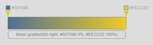
The "GradientGenerator" will output CSS as a string like :
"linear-gradient(to right, #507090 0%, #EECC22 100%)".
So our business logic needs to build that string dynamically from the current state.
The loop for generating the string looks like this :
                                                let styleStr = 'linear-gradient(to right, ';

                                                this.colors.forEach(function(color, key) {

                                                        styleStr += color.color + ' ' + color.position + '%';

                                                        if (key < this.colors.length - 1)

                                                                styleStr += ', ';

                                                }, this);

                                                styleStr += ')';
For the scope of this tutorial, we’ll keep it straightforward : assign the computed gradient string directly to the component view’s DOM "style.background", and also push it into the first child’s reactive "text" stream so the user can copy it (that child is a SimpleTextReplace). This is intentionally direct ; we’d have switched to a cleaner pattern if this weren’t your first component (We’ll get into this in detail in the next chapters.)
                                                this.view.getMasterNode().style.background = styleStr;

                                                this._children[0].streams.text.value = styleStr;
Voilà, our template is done. Time to sprinkle in a bit of styling — and the full file will now look like this :
// gradientGeneratorHostDef.js

const {TemplateFactory, CreateStyle} = require('formantjs');


var gradientGeneratorTemplateFactory  = function(options) {


        return TemplateFactory.createDef({

                host : TemplateFactory.createHostDef({

                        nodeName : 'gradient-generator',

                        subscribeOnChild : [

                                {

                                        on : 'update',

                                        subscribe : function(e) {

                                                if (e.data.type === 'colorChanged')

                                                        this.colors[e.data.key - 1].color = e.data.value;

                                                else if (e.data.type === 'positionChanged')

                                                        this.colors[e.data.key - 1].position = e.data.value;


                                                let styleStr = 'linear-gradient(to right, ';

                                                this.colors.forEach(function(color, key) {

                                                        styleStr += color.color + ' ' + color.position + '%';

                                                        if (key < this.colors.length - 1)

                                                                styleStr += ', ';

                                                }, this);

                                                styleStr += ')';


                                                this.view.getMasterNode().style.background = styleStr;

                                                this._children[0].streams.text.value = styleStr;

                                        }

                                }

                        ],

                        sWrapper : CreateStyle([

                                {

                                        selector : ':host',

                                        color : '#777',

                                        position: 'absolute',

                                        left: '50%',

                                        marginLeft : -(options.width / 2) + 'px',

                                        marginTop : '50px',

                                        width : options.width + 'px',

                                        height : '40px',

                                        border : '1px #777 solid'

                                },

                                {

                                        selector : ':host p',

                                        fontSize : '14px',

                                        textAlign : 'center',

                                        width : (options.width - 4) + 'px',

                                        height : '26px',

                                        marginTop : '45px',

                                        paddingTop : '8px',

                                        border : '1px #777 solid',

                                        borderRadius : '7px',

                                        cursor : 'text'

                                }

                        ])

                })

...

}


module.exports = gradientGeneratorTemplateFactory;
To wrap up the app, let’s fine-tune the startup phase — right now, our GradientGenerator is just sitting there with an empty colors array.
To figure out how many child components the GradientGenerator actually has, we’ll use a lifecycle hook that’s decoupled from the instantiation phase. This hook runs only after the DOM has been rendered.
In "GradientGenerator.js", add a property to the prototype :
// GradientGenerator.js

GradientGenerator.prototype._asyncRegisterTasks = [];

GradientGenerator.prototype._asyncRegisterTasks.push(new TemplateFactory.TaskDefinitionModel({

        type : 'lateBinding',

        task : function() {

                this._children.forEach(function(child, key) {

                        if (key > 0)

                                this.colors.push({

                                        color : '',

                                        position : (child._key - 1) * 100

                                })

                }, this);

        }

}));
Last step : give the app an initial state.
// app.js

module.exports = function(parentView) {

        return {

                init: function(containerSelector) {

                        const root = new App.RootView();

                        const gradientGenerator = new GradientGenerator(null, root.view, {width : 400});


                        App.renderDOM();


                        gradientGenerator._children[1].streams['currentColor'].value = '#507090';

                        gradientGenerator._children[2].streams['currentColor'].value = '#FFDD22';

                }

        }

}
And that’s it — your first GradientGenerator is alive and kicking.
After all that, you’ve now built a fully working app from scratch — templates, styles, reactivity, lifecycle hooks, the whole deal. Before we wrap up, let’s take a step back and see how you might take it further.
Post-Scriptum :
Now that you’ve got a complete picture of the framework, go back to the earlier examples and imagine alternative ways to implement this app. The current version keeps things short and sweet, but the GradientComponent doesn’t really take advantage of overriding its default template, and it uses a lifecycle callback that’s not actually necessary.
Hint : since we don’t necessarily know the number of handles at instantiation time (you might want three handles instead of two in the minimal case), how would you split the default template from the overrides ?